Project: App bringing joy to the packing experience
Role: UX and UI Design
Tools: Illustrator and InVision
Challenge
Create an app that benefits frequent flyers and holidaymakers alike. How does the product make packing an easier and more enjoyable experience for two diverse groups with differing needs?
A friendly astronaut to guide users through the onboarding process
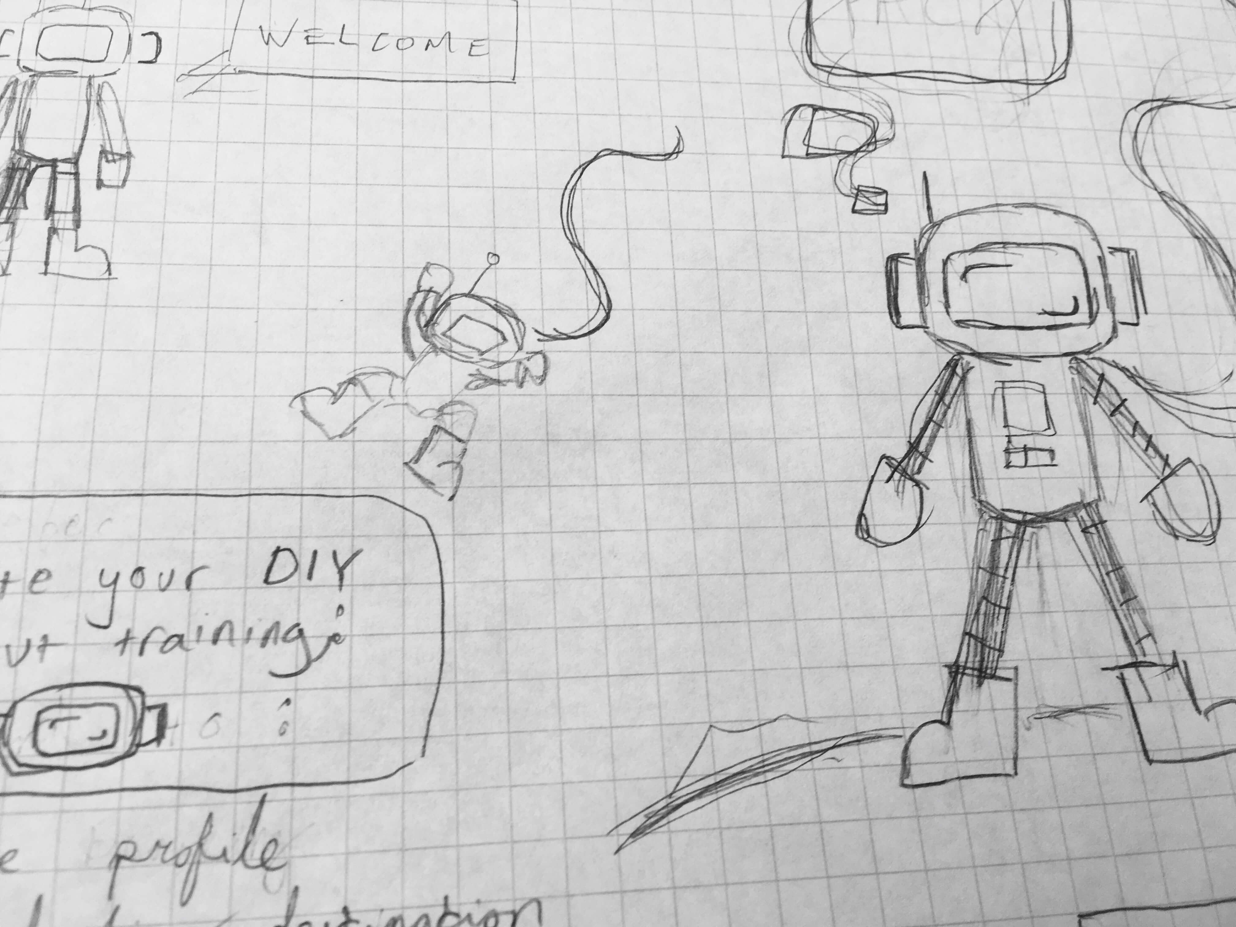
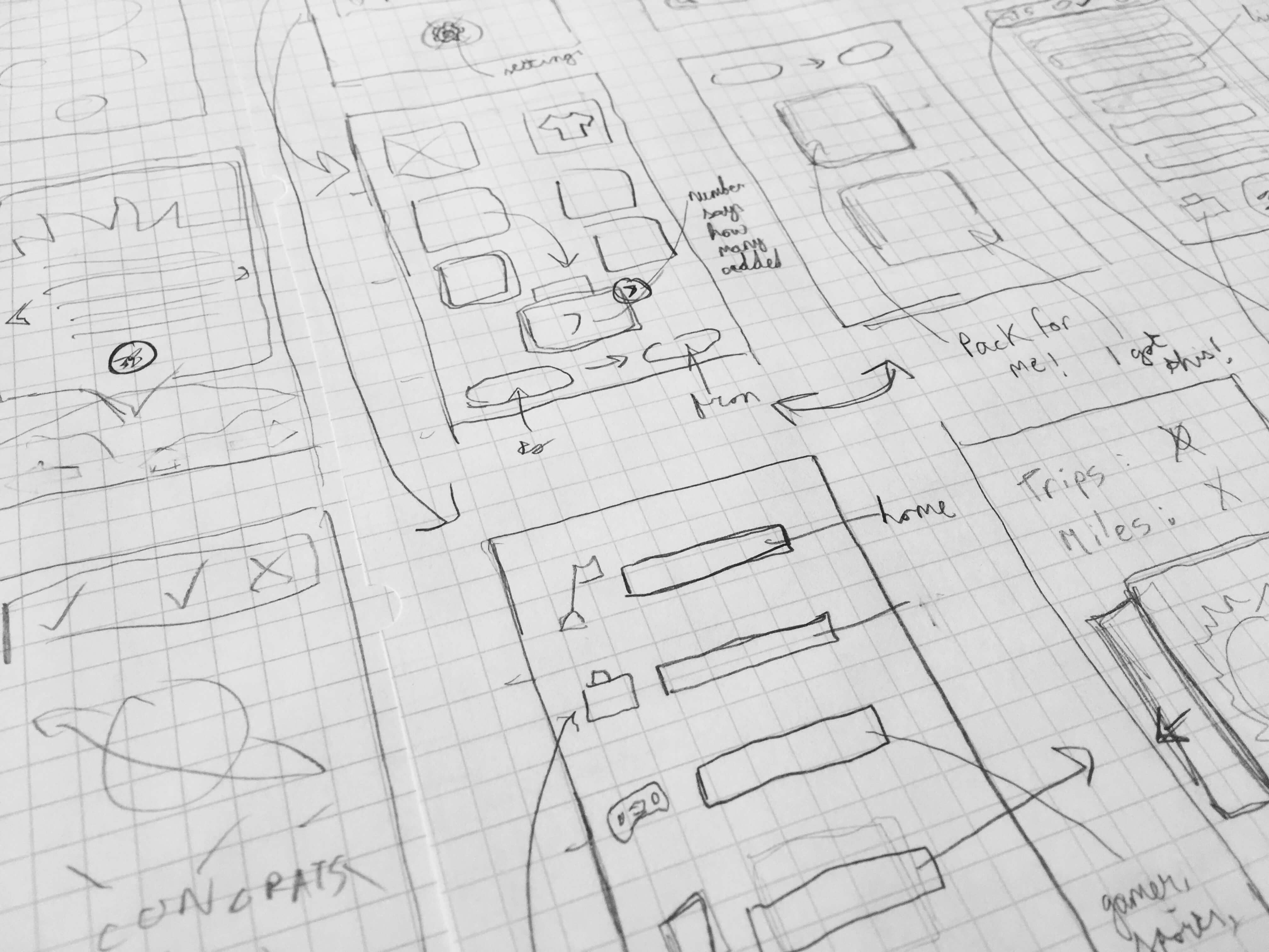
Paper prototyping and early wireframes
Approach
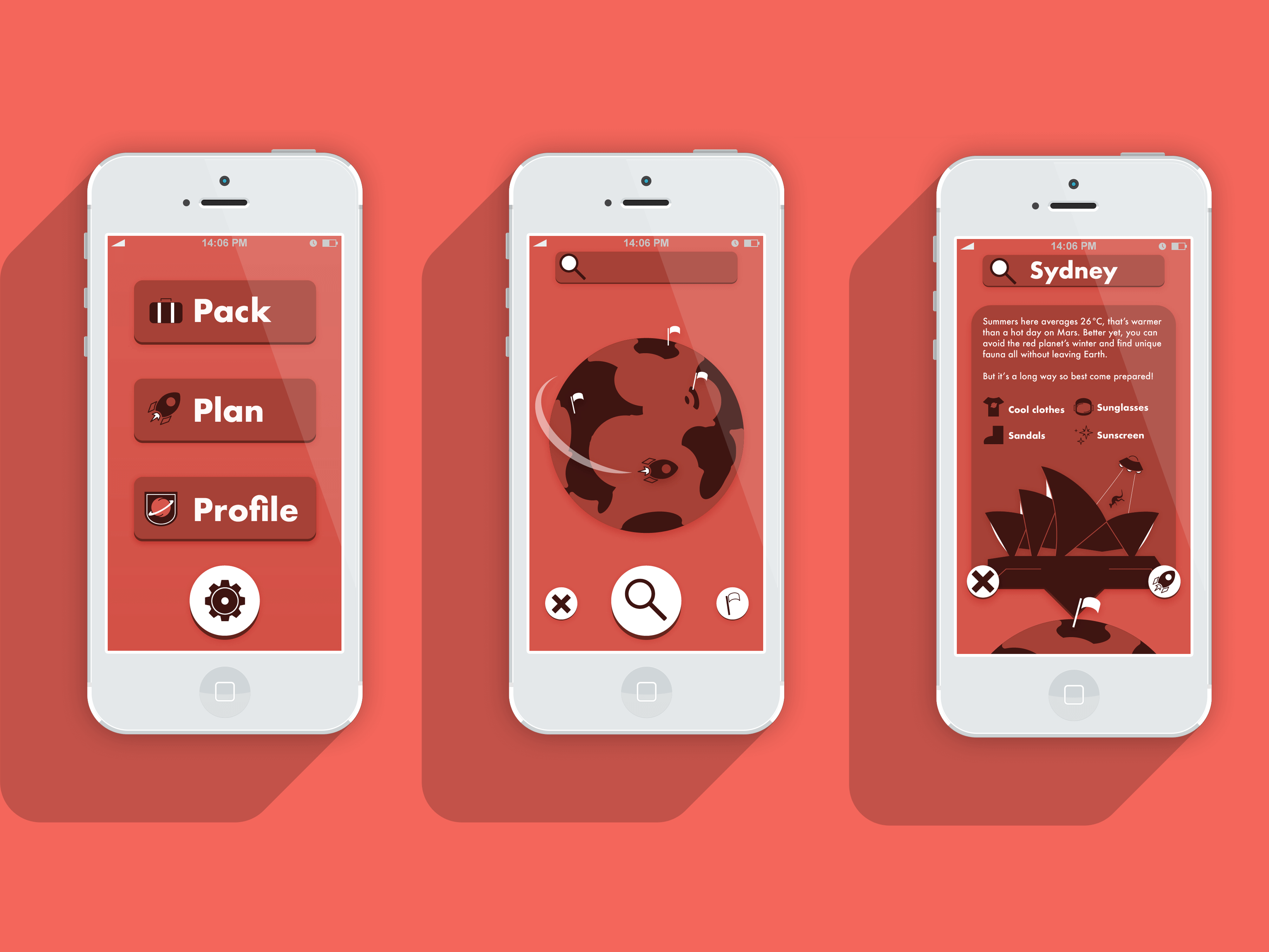
The needs and travelling method of an excited holidaymaker on their first trip to Spain and a frequent traveller on their way to a new conference differ but both have a common pain point: packing. What do you bring? How much? Thus Pack-Naut was born; an app that can not only provide valuable information and accelerate the process by generating personalised packing lists but also deliver an immersive experience where users are rewarded for travelling, making long flights seem like less of a chore. An app that can pack your bag based on your destination and personal preferences is useful, one that can also tell you how long you will survive on Mars with that same bag is fun.
Original space travel themed icon set encapsulating the playful but practical tone
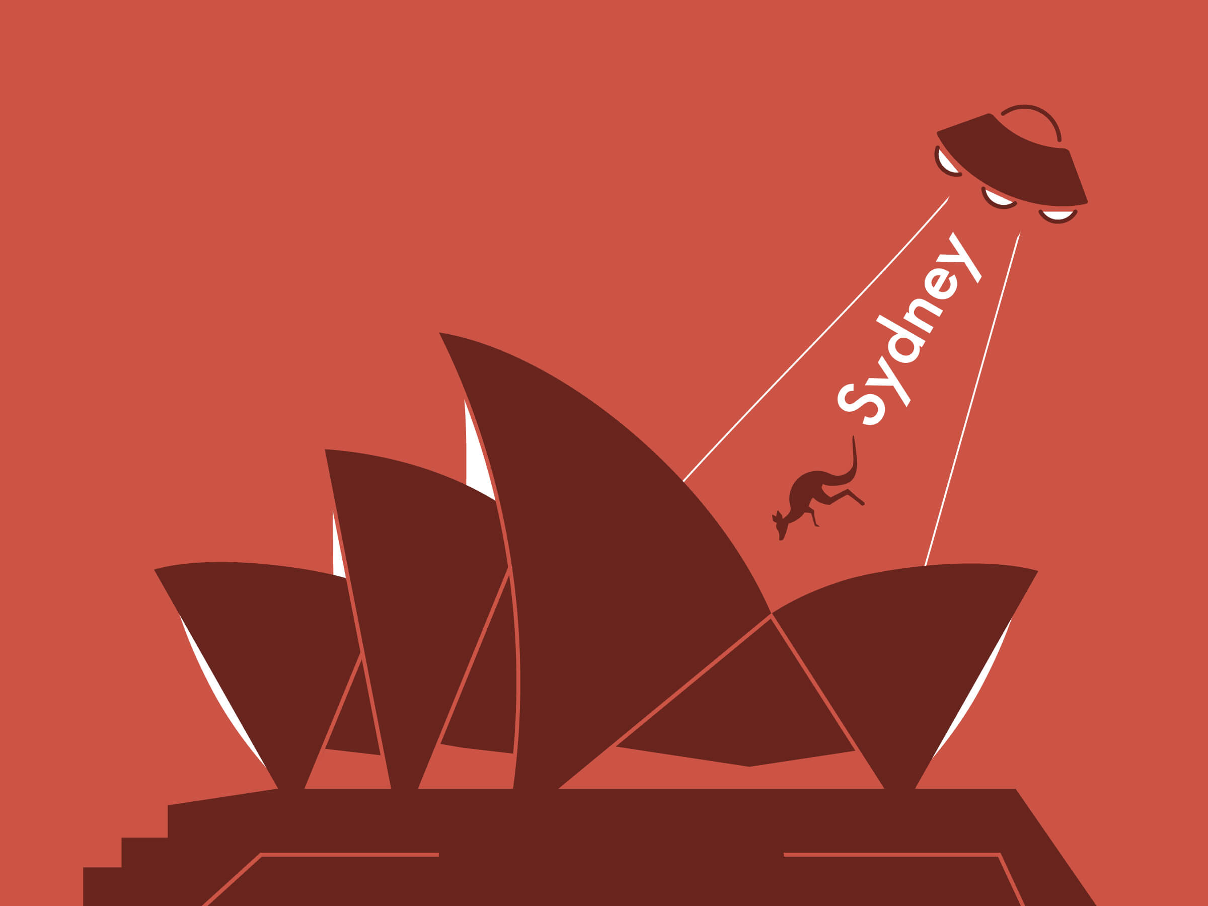
Example destination: the Syndey Opera House complete with UFO
Solution
Pack-Naut was built from the ground up with a colourful, illustrated interface (featuring the odd UFO or two) to support the theme and immerse the user in the app’s world of quirky space travel. The icons establish the style, wordlessly conveying the playful but practical tone and theme. The illustrations and interface evolved from there, focusing on removing the need for lengthy explanations that might break immersion.
The slogan might be ‘there’s always space for more’ but the style is purposely minimal to make navigation a breeze. Testing for optimal target sizes and button positioning was essential to create an app that is easy use with one hand or two. Combined with a colour scheme inspired by Mars, the interface becomes an immersive atmosphere to take packing to another world (or rather, planet) so the user can enjoy the process whether they are generating their first packing list or planning a trip with their favourite saved bag.
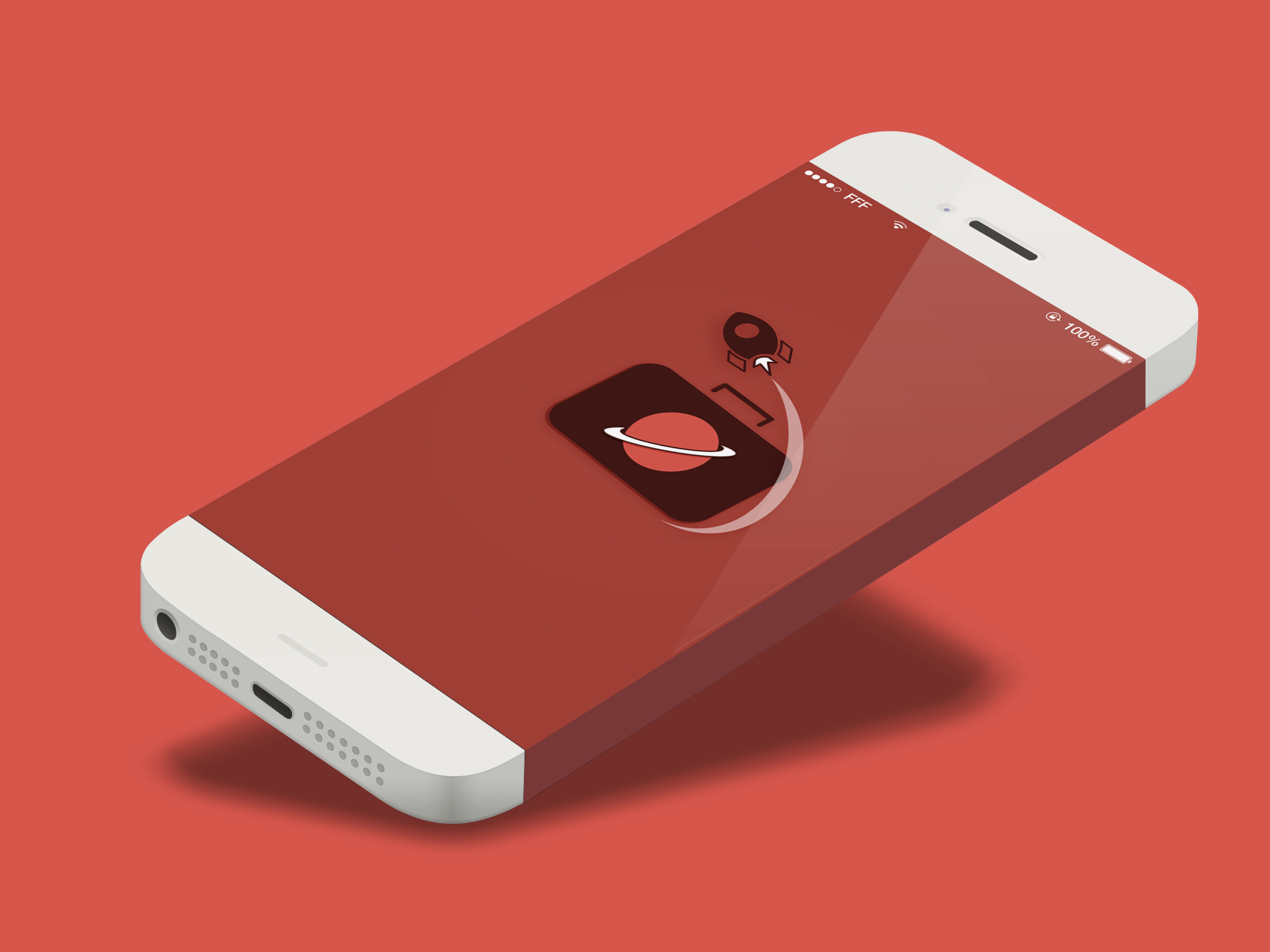
The journey begins here
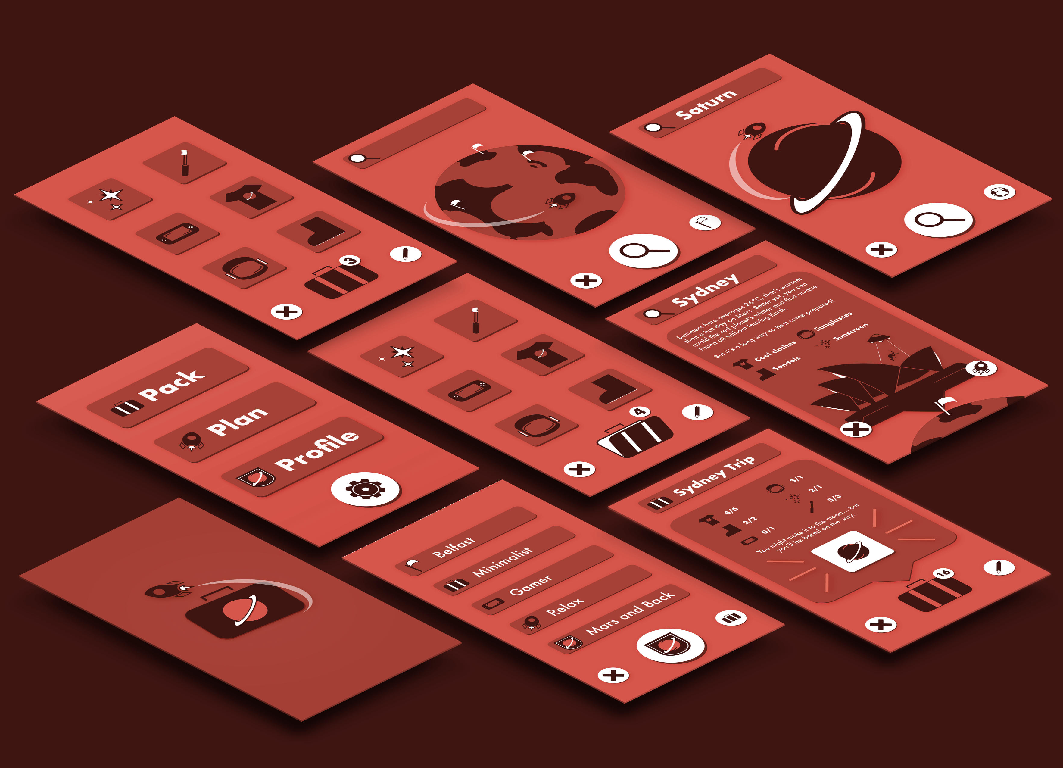
All the screens for the initial prototype, including a hidden interstellar destination
Reflection
Building a user interface from the ground up meant no asset could be taken for granted. Illustration, a new found love of icon design, nailing the wireframes, and a fresh appreciation for the practical aspects of UX, from heat maps to appropriate target sizes and designing with colour for accessibility, were all essential. For me, a good user experience should be not only functional and intuitive but enjoyable. The ultimate hope is that the app is as enjoyable to use as it was to make.
Made to the Sound of Zion.T - OO