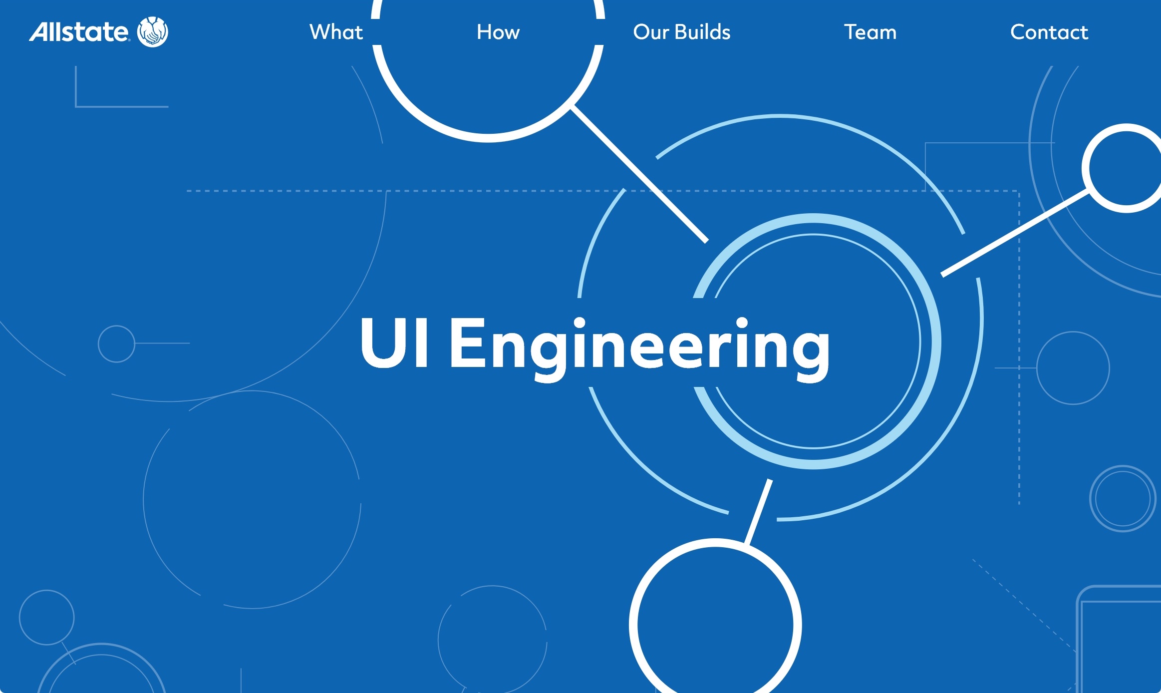
Project: Brand identity and online hub for all things UI Engineering at Allstate
Role: Branding, UI Design, and Development
Tools: Sketch, ReactJS, SVGs, Greensock
Challenge
Design a fresh brand identity and showpiece website that can inform both an internal audience and prospective employees about UI Engineering, all chronicled in weekly posts to help inform other young designers starting out.
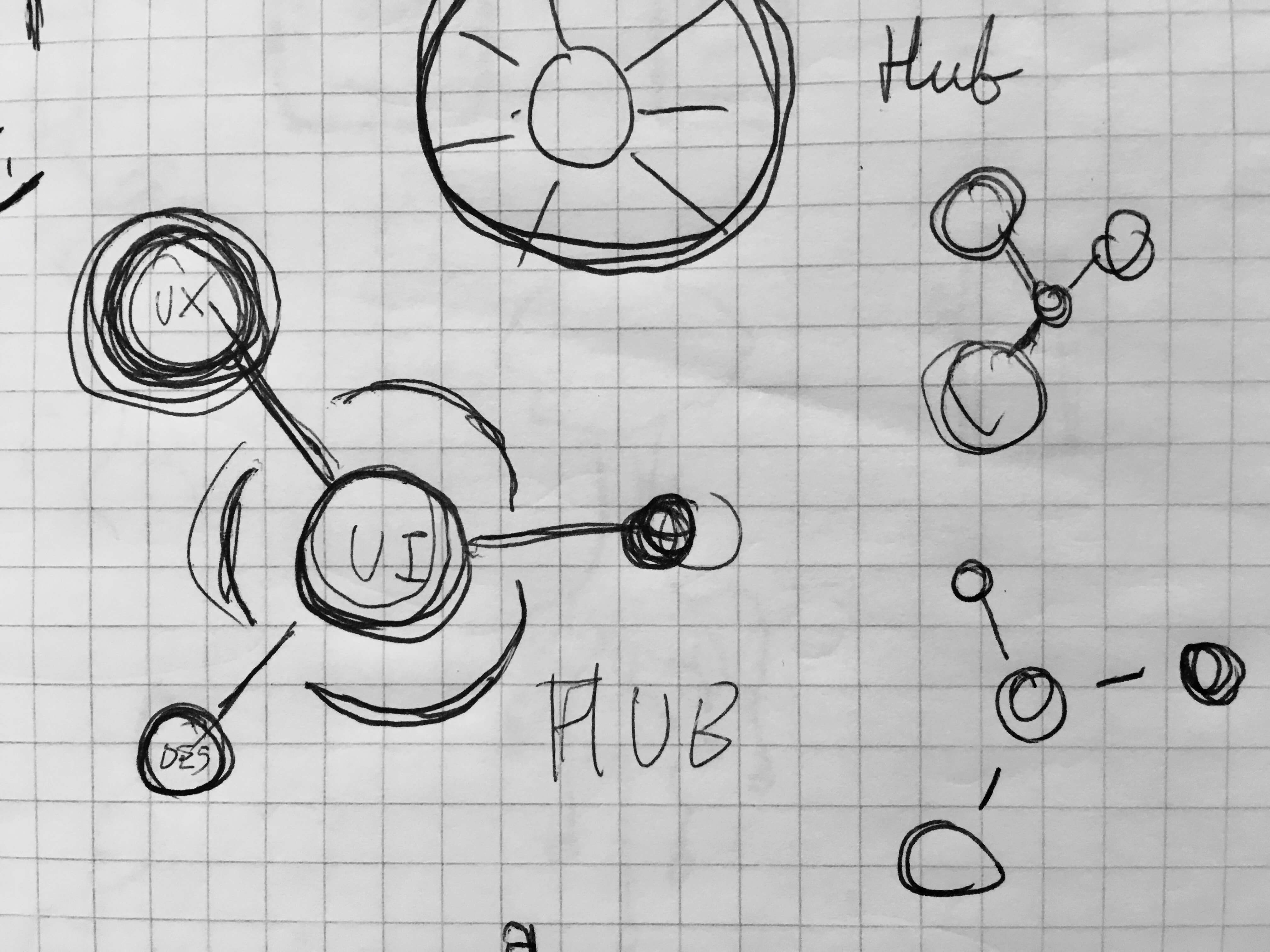
Rapid sketching and brainstorming until the final logo emerges on paper.
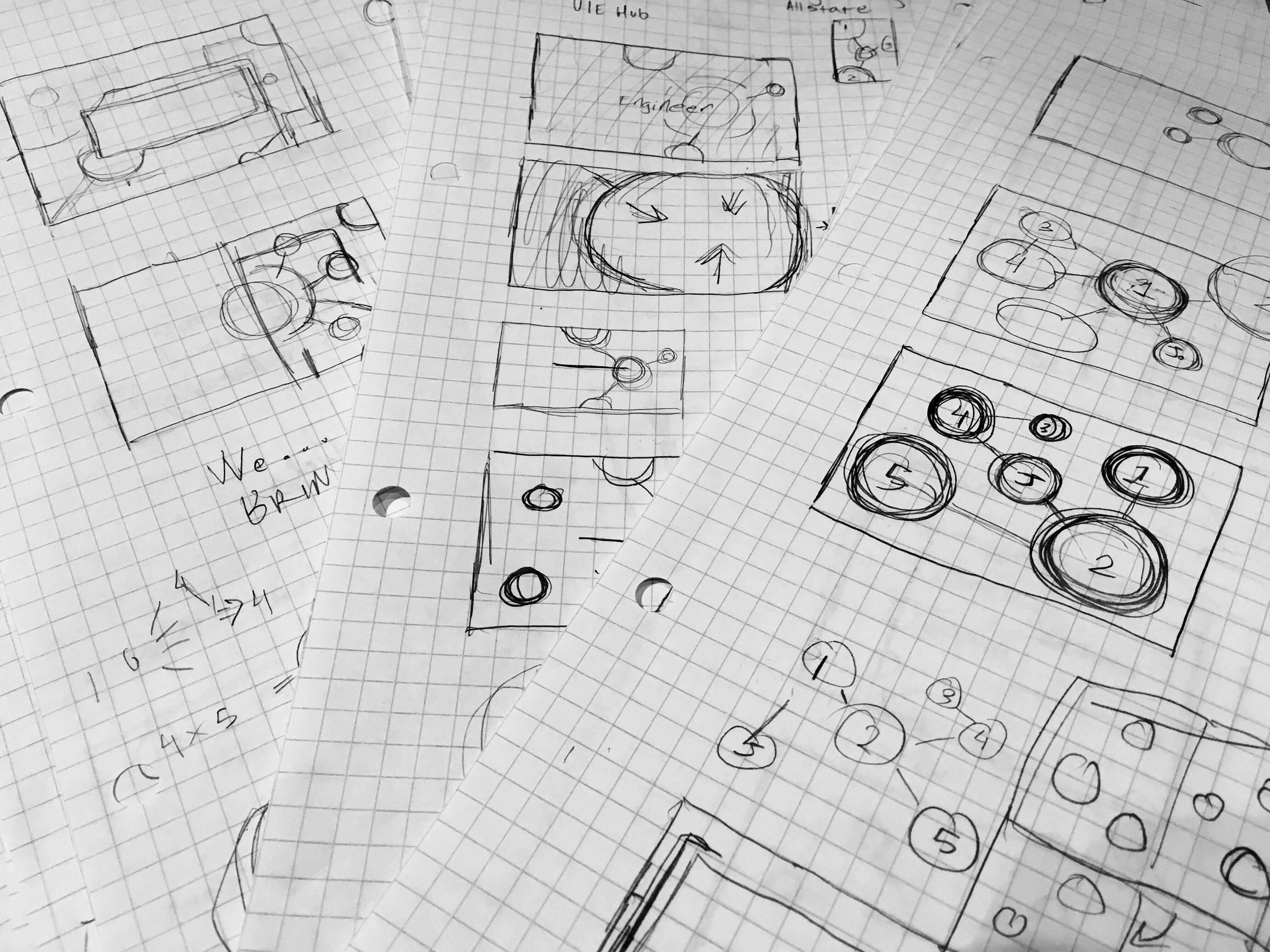
From paper to reality: storyboarding interactions and wireframing
Approach
“Bringing UI to Life.” That tagline represented the sum total of the UI Engineering brand when we began. The trouble was, no one outside the department knew what that meant. Employees spread across 3 different countries came with questions ranging from design woes to technical troubleshooting and interested parties outside the company could only view the general employment portal. To address this, UI Engineering needed a clear identity and showcase that could bring together two different audiences.
Put in charge of developing the brand, I first began brainstorming around the central idea of life. It needed to a flexible identity able to fit seamlessly with the Allstate brand while establishing itself as an independent organism within the company. Discussion with stakeholders helped push the design towards a more scientific and technical concept to reflect the services offered and industry. From there, an online presence would be developed to push boundaries in both design and development with previously untried technology combinations for the team. To deliver the initial launch at the end of 12 weeks involved an extensive research and prototyping period, frequent stakeholder meetings and critiques, planning and scheduling the MVP goals, and learning it all as we went along.
Chronicling the whole experience online brought my notes to life, not only cementing what I learned in my own mind but sharing the knowledge with others. Experiencing the pain points of entering a new working environment with no prior information about it not only motivated me to share what I learned but informed work on the hub to ensure prospective employees would be able to find the information they need.
Developed from sketches and wireframes, a final set of mockups helped determine which design to pursue
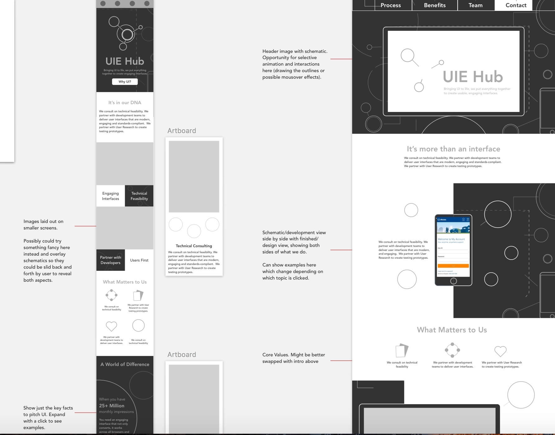
Content curation was key: from crafting unique icons and illustrations to tailoring fresh copy
Solution
The result of rapid iterations, the final logo looks at life at the molecular level: the essential design that determines the surface as in the case of UI Engineering, the bonds which unite the atoms reflecting the way the department connects design and development.
The website expands this concept: blueprints and white space representing development and design with UI Engineering bridging the gap between the two. Interaction design reinforced the theme, from the molecular-style array to transitions reminiscent of atomic collisions. Central to all was content design, weaving technical information with practical examples and the benefits they bring to simplify but never ever stupefy. To quote the voice & tone guidelines we set out: “we are professionals, not robots”.
Motion design inspired by atomic collisions
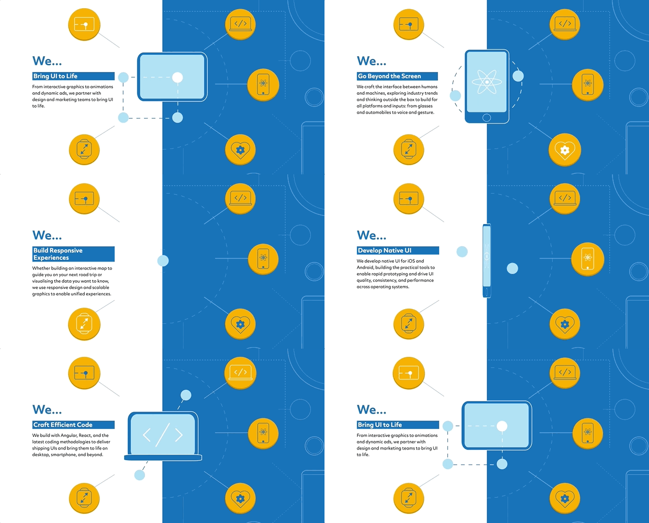
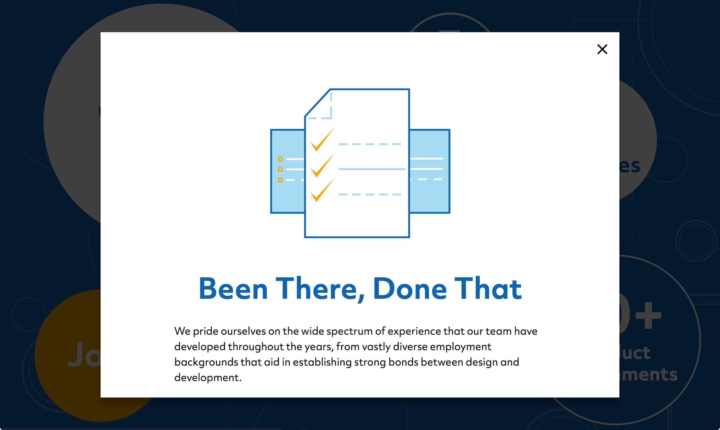
The team section struck a more personal tone, showing off the benefits of working with UI Engineering as a client and a fellow team member
Reflection
Tools and techniques may be unfamiliar but principles remain. From rapid prototyping, pair programming, agile methodologies, to ReactJS, more SVGs than you can shake a stick at, scheduling it all, and blogging the whole process, the project was full of firsts for me. But at the end of the day, you still start on paper, fight for the user, and make attention to detail meet big picture to craft the best design possible.
Made to the Sound of Ivy Levan - No Good
All designs shown © Allstate 2017