Pack-Naut
A packing app where there is always space for more
Brief:
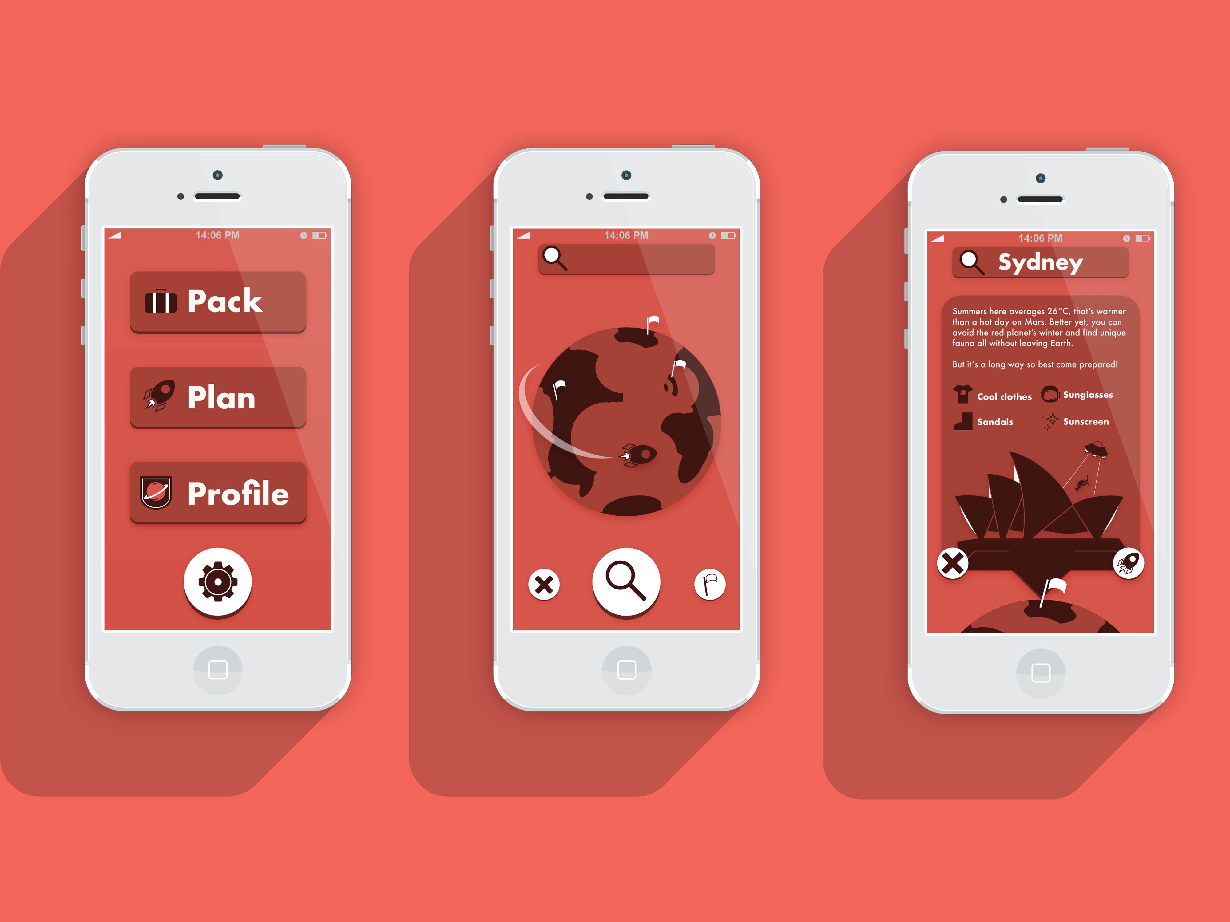
Design a travel app interface with a focus on original illustrations and thematic icons.
Goals:
- Create an app that could benefit frequent flyers and holidaymakers alike
- Make packing easier and more enjoyable
- Craft an immersive experience that makes long flights seem like less of a chore
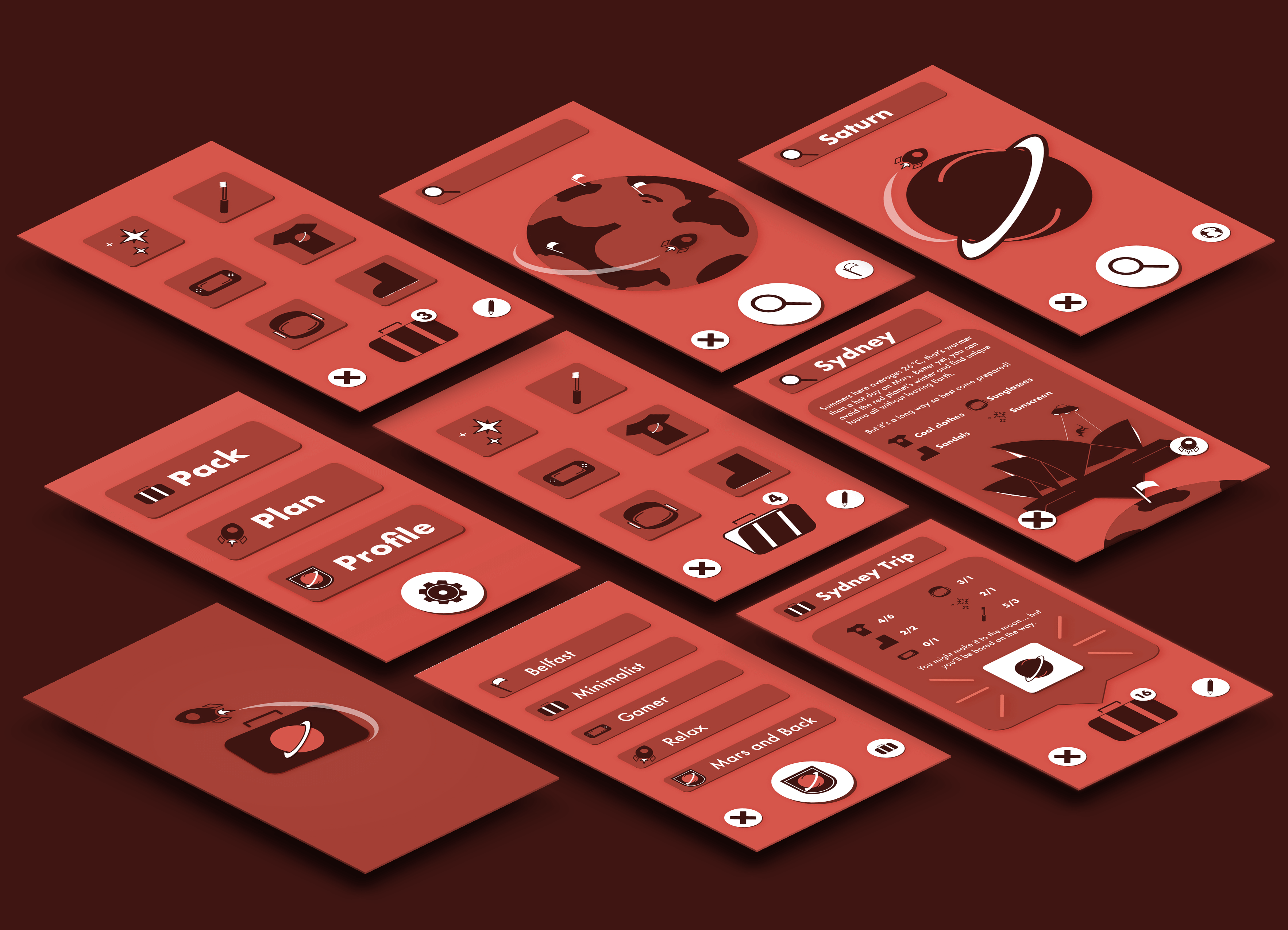
- Keep the interface minimal with a focus on iconography over lengthy explanation
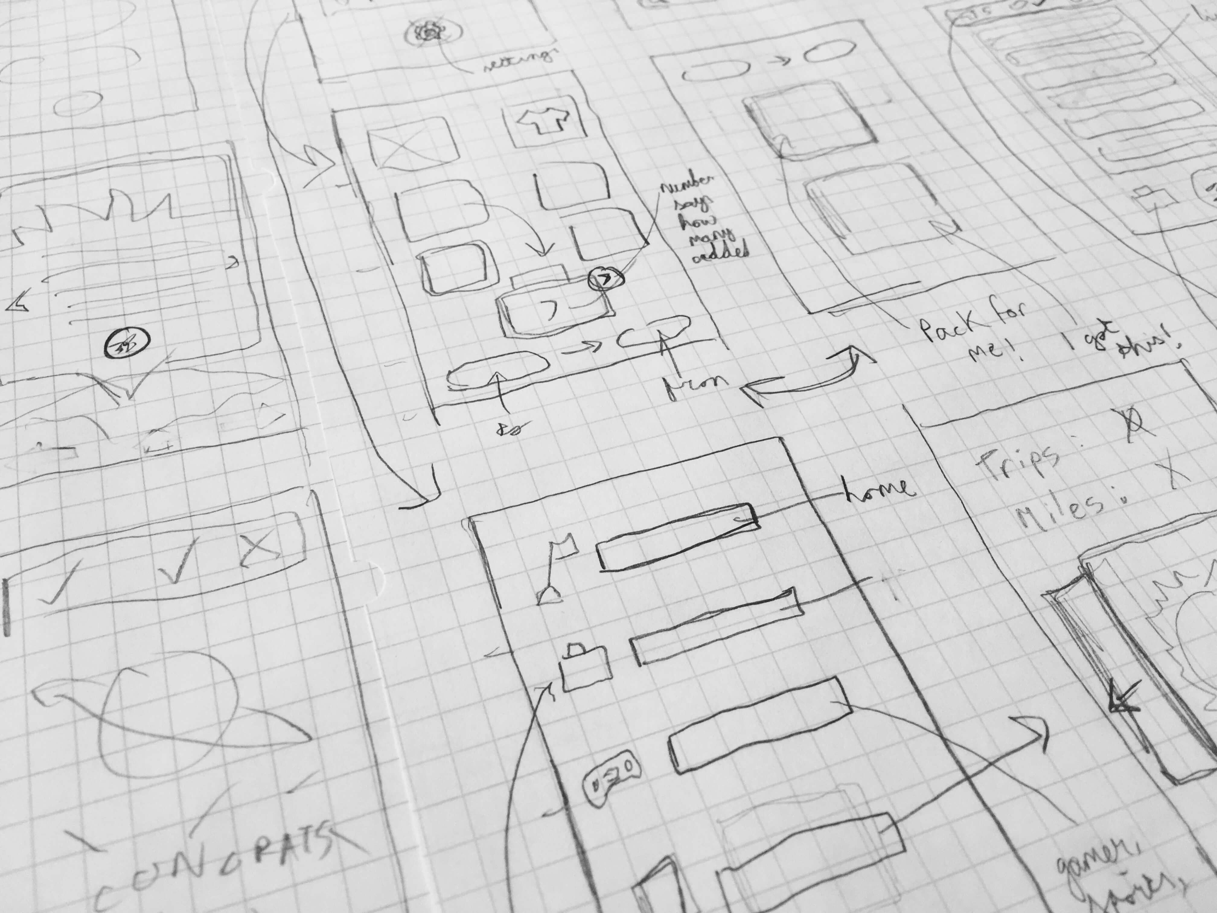
Approach:
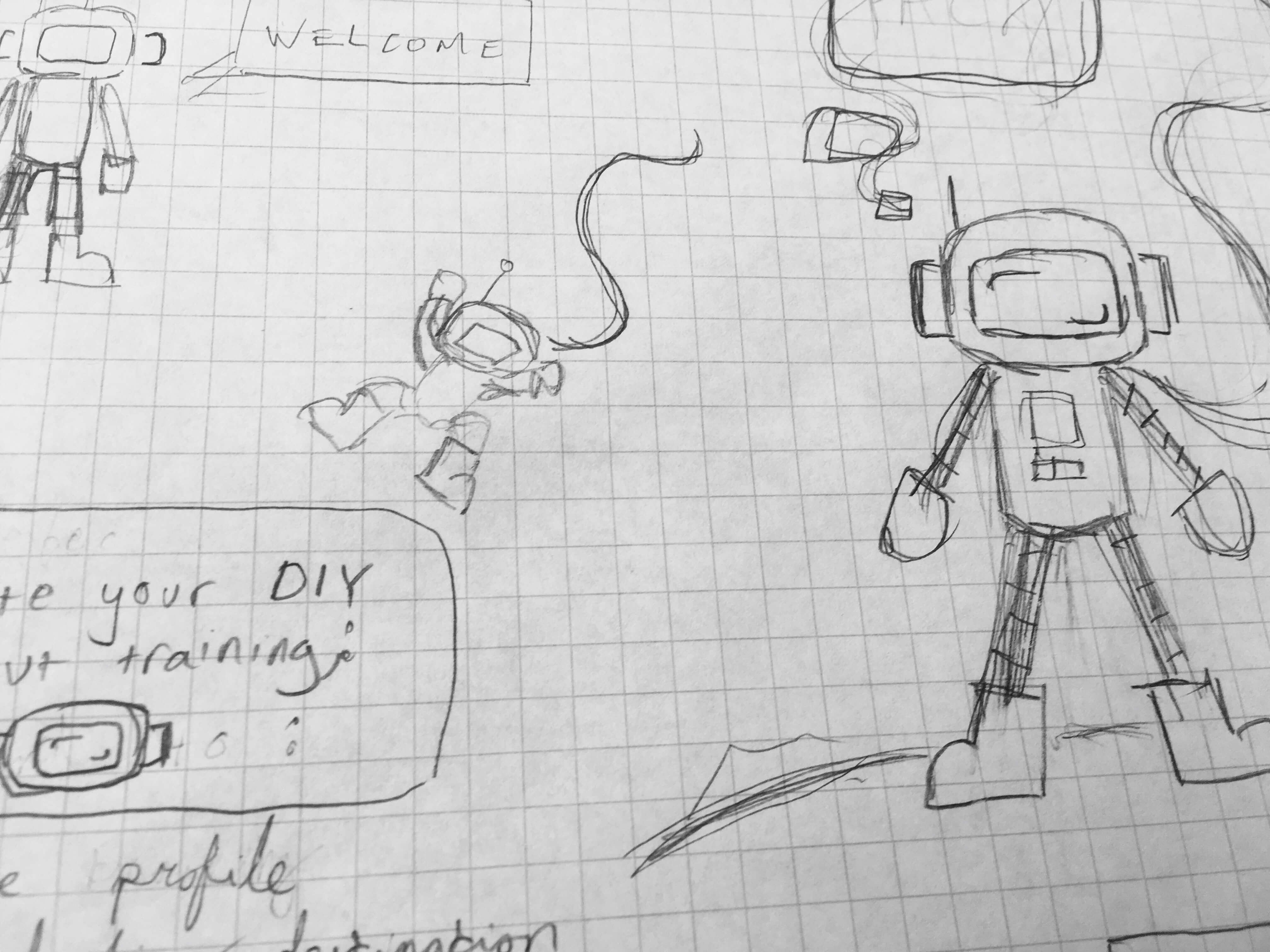
The one thing I dislike most about travelling was packing, especially packing for long flights with no idea what it will be like on the other side. I have yet to meet anyone who actually enjoys packing and it is one of the frequent complaints when it comes to travelling/moving. Thus Pack-Naut, an app to make the experience more enjoyable, was born. An app that can make recommendations based on your destination and personal preferences is useful, one that can also tell you how long you will survive on Mars with that same bag is fun.
Execution:
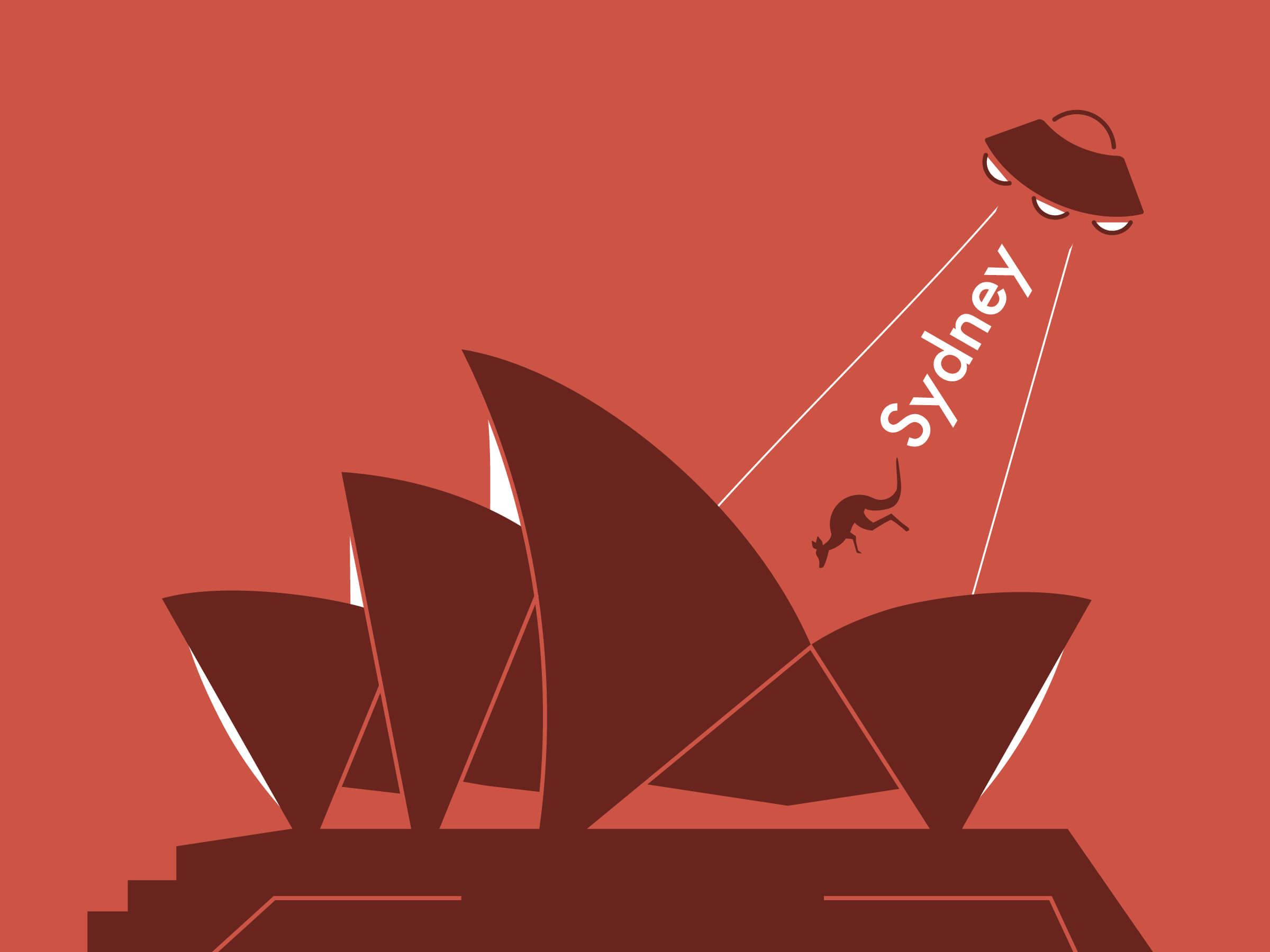
Once the concept was established, the Pack-Naut interface was built from the ground up. It is only fitting that a space-travel themed packing app has space-travel icons and illustrations with the odd UFO. The icons were the true trend setters, wordlessly conveying the playful but practical tone and theme. The illustration and interface evolved from there.
The slogan might be ‘there’s always space for more’ but the style itself was purposely minimal to put an emphasis on the content. Combined with a colour scheme inspired by Mars, the interface becomes not just a collection of assets but an immersive atmosphere to take packing to another world (or rather, planet).
The Result:
Building a user interface from the ground up meant no asset could be taken for granted. Illustration, a new found love of icon design, nailing the wireframes, and a fresh appreciation for the practical aspects of UX, from heat maps to appropriate target sizes and creating an interface that could be used with one hand or two, were all essential. For me, a good user experience should be not only functional and intuitive but enjoyable. The ultimate hope is that the app could be as enjoyable to use as it was to make.
