Project: Complete personal brand and visual identity for a creative monster
Role: Branding, Visual Design, Copywriting, Web Design
Tools: Illustrator, HTML, and CSS
Challenge
How do you develop a flexible brand that encompasses both quirky illustrative and bold minimalism?
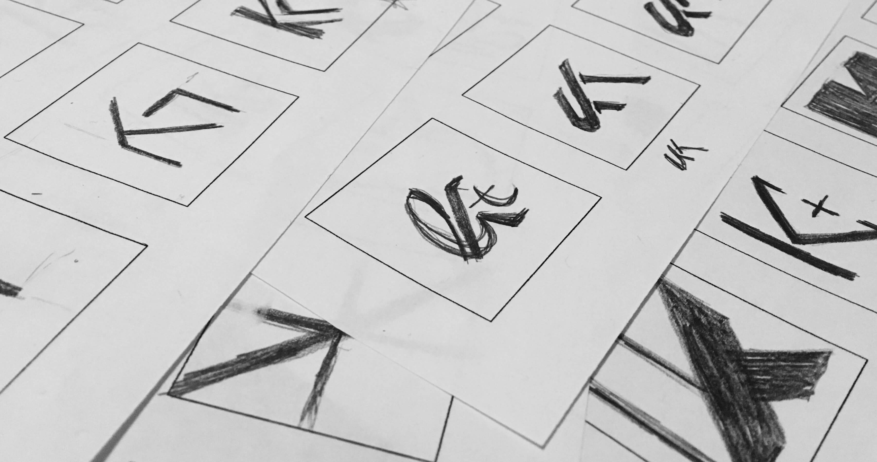
To say many monogram ideas were sketched would be an understatement
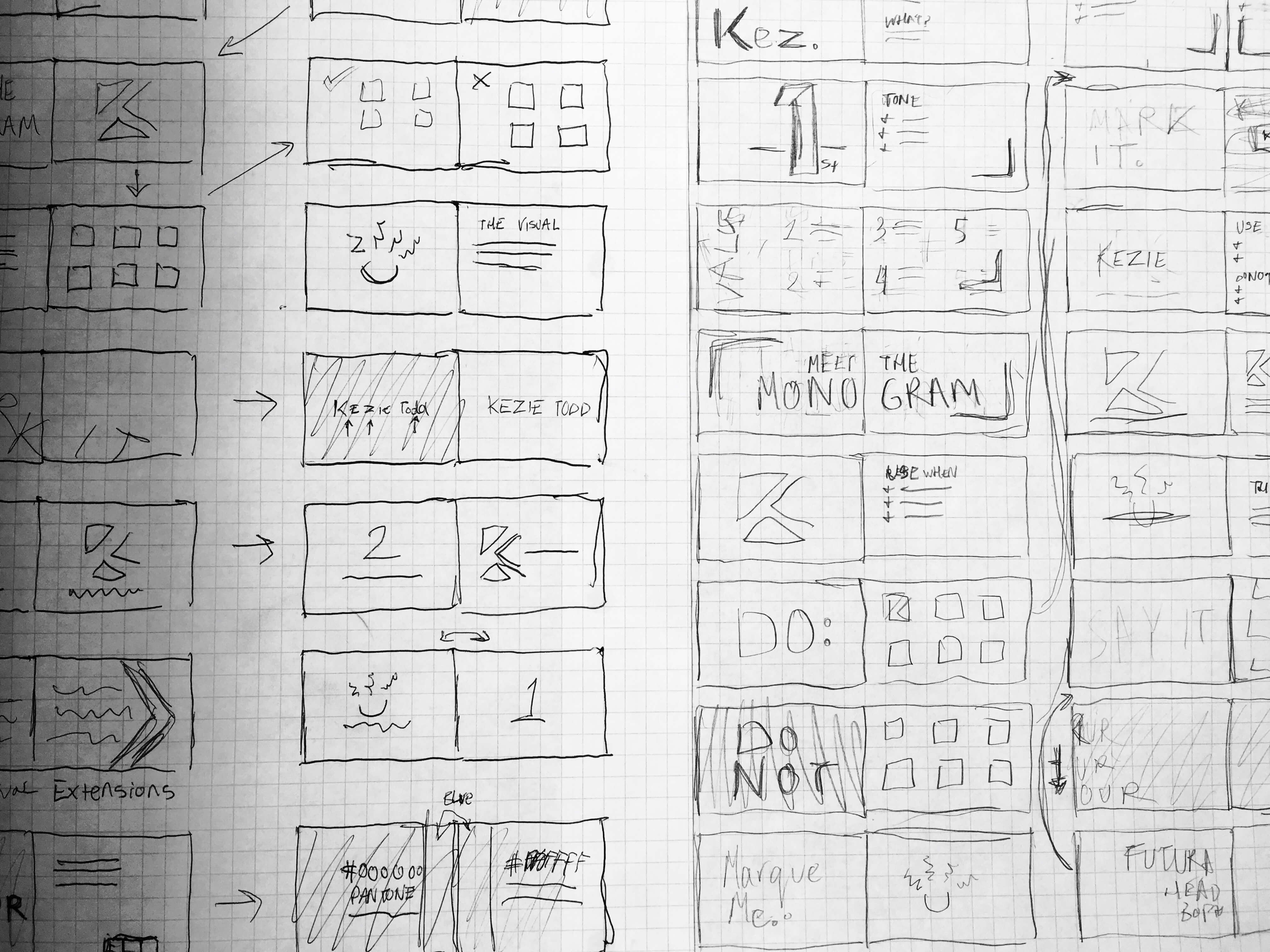
From the guidelines layout to the website wireframes, everything was prototyped on paper first
Approach
Before pen could be put to paper, extensive research and analysis was undertaken to evaluate both visual identity and branding in general as well as a particular marketing niche and the essence of the personal brand. The aim was to create a multifaceted and flexible brand that represented my own range while distilling the core of who I am and what I do: designs with personality in bold and quirky style.
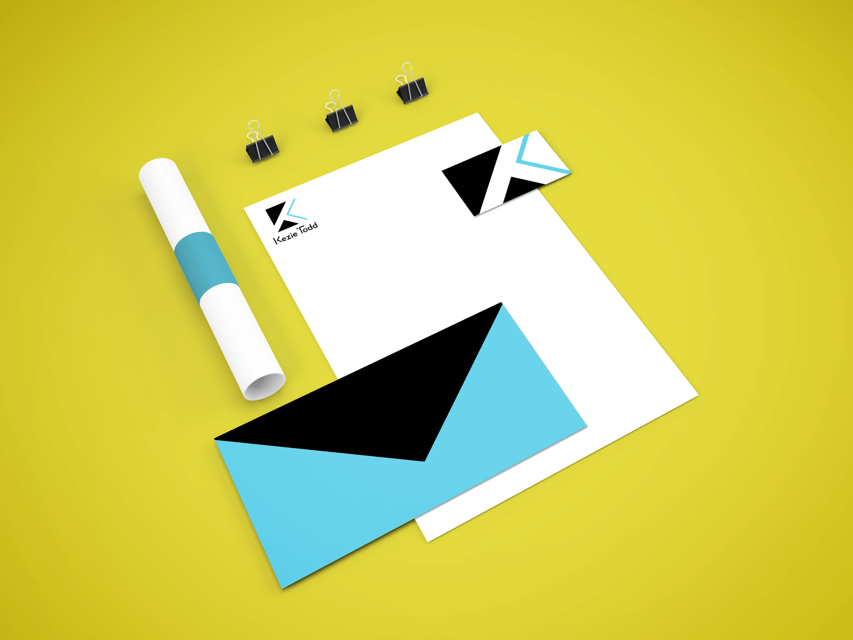
The final monogram, designed to emphasize the 'K' and leave the 'T' in the negative space to the imagination


The final visual marque, combining a sun, my hair, and just a touch of Medusa
Excerpt from the brand guidelines, designed to show off the brand through the design as well as copy
Solution
The central challenge was uniting the core contrast— both fun and professional, illustrative and bold, unique but flexible— into a single brand. Breaking it down into the three visual representations: monogram, wordmark, and visual marque, let each manifest an aspect of the brand. The monogram stands as a representation of the brand’s minimal and bold style, the visual marque as an avatar of the brand’s character (and myself), while the word mark bridges the gap between the two. A consistent graphical device, the arrow, encompasses the brand’s bold simplicity, unifying all three visuals and providing a flexible element for brand extensions.
Devised to suit the bold but minimal identity is a three colour system. With an emphasis on the usage of colour rather than specific hues, the flexible design of each asset grants the identity further expandability with more colours. The primary sunny day blue reflects the duality of the brand and can be calming and friendly on a white background or a bold splash on black.
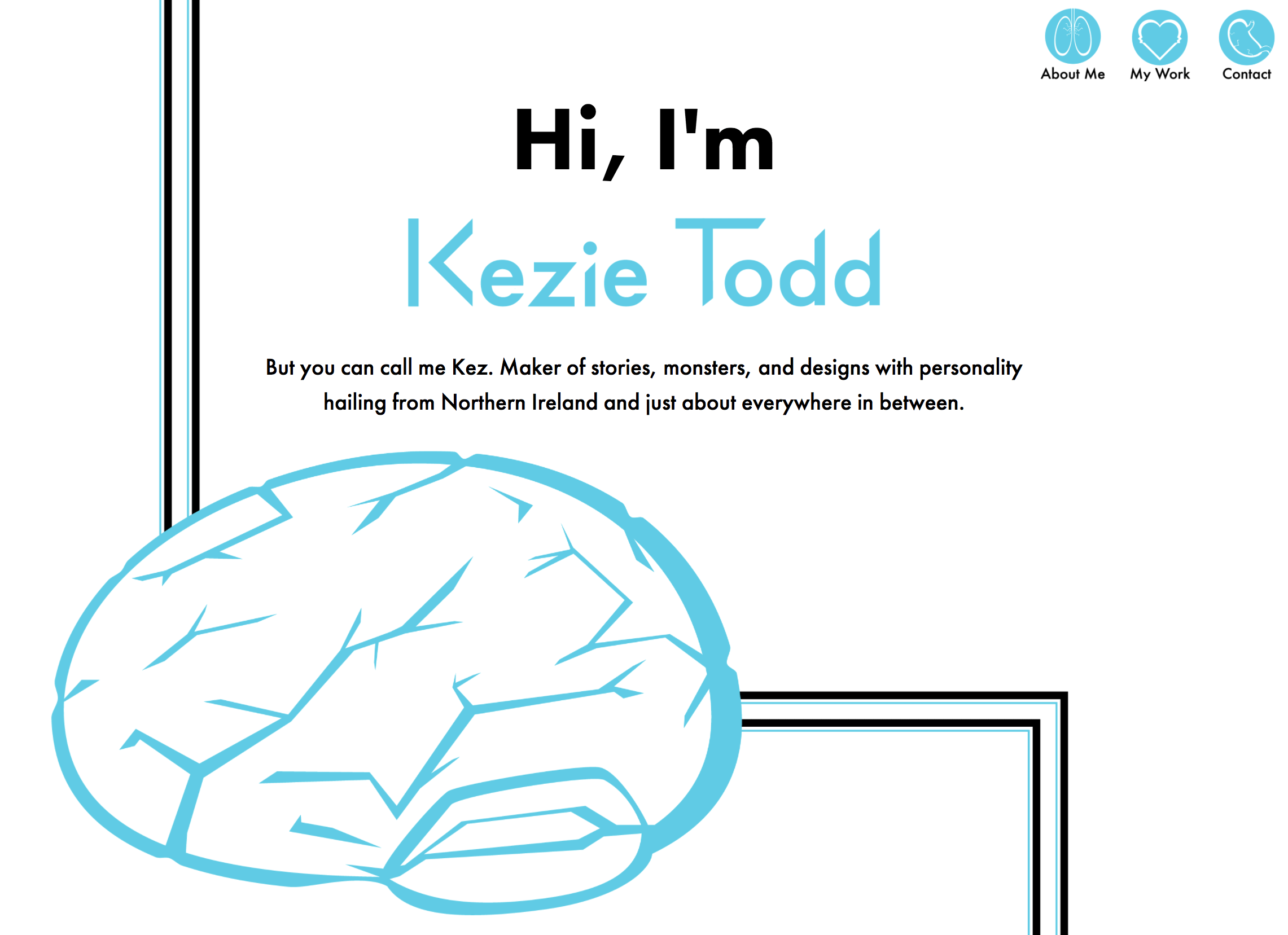
You can't get much more personal than your innards
Reflection
The most challenging aspect of the project was not the design itself but creating a brand that captured me as a designer. The process demonstrated how essential it is that designs reflect the subject and convey their values and style. A design can be technically good but if it does not convey your character and not just what you do but who you are, do you really want it to be your visual representation?
This reinforced to me how all encompassing a quality identity must be, from the visual brand to the tone of every piece of copywriting. I am only satisfied when there is character in every mark. With that kind of established personality, even an illustrated portfolio website can become an extension of the brand.
Made to the Sound of BIGBANG - Made